Cover art
The 25 Best Absolute Batman Covers, Ranked
Twenty-five standout Absolute Batman covers, from Dragotta’s first towering silhouette to the Chainsaw Man and Akira homages.
 Issue 18
 Issue 24
 Issue 01
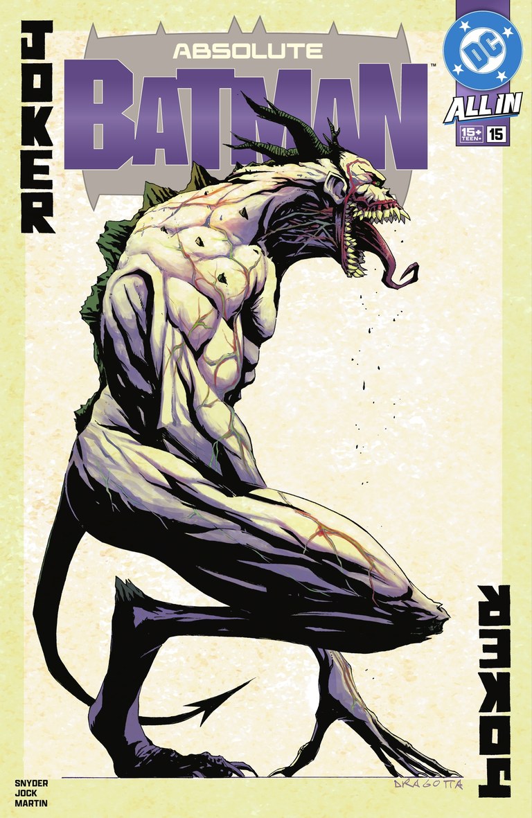 Issue 15
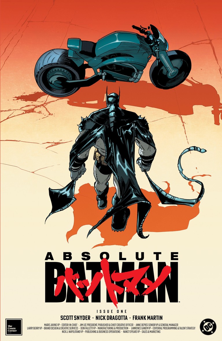 Issue 01
A great cover makes you stop before you turn the first page. With Absolute Batman, that can mean a huge silhouette, a grotesque face, a surprising color choice, or a small detail that changes the whole image.
What interests me about these covers is how differently the artists respond to the same character. Some push his size until he barely fits the frame. Others pull back, use the city around him, or let a few simple shapes carry the idea. The strongest ones give you something to discover after that first glance.
These are my 25 picks from the main covers, variants and retailer exclusives for issues #1–25. Some issues appear more than once. I’m looking at composition, visual storytelling and the individual choices that make a cover worth returning to. Read the countdown, browse the images, and see where your own favorite lands.
Browse all 25 covers at a glance
Choose a cover to jump to its place in the countdown.
The countdown
From 25 to the one we keep coming back to.
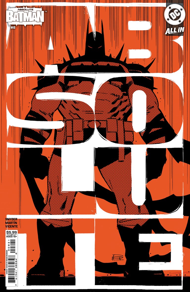
Cover art: Bruno Redondo.Lunar edition listing Image source Absolute Batman #8Number 25: The lettering becomes the image
Bruno Redondo
Cover B, cardstock variant
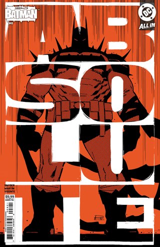
Back to the cover indexEnormous white letters cut across an orange-and-black Batman, breaking the word ABSOLUTE into the structure of the page. Redondo keeps the figure’s silhouette simple enough to survive that interruption. The halftone texture adds grit, but the first impression remains bold and immediate.
This is a cover that understands the value of being seen small. You can register the body and the typography almost at once, then look again to follow how they overlap. Its place here comes from that complete design idea: the title occupies the same visual space as the character.
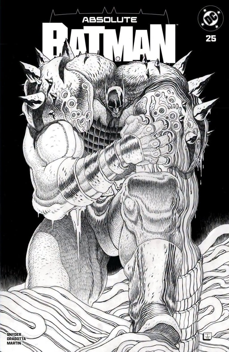
Cover art: Ian Bertram.Original exclusive listing Absolute Batman #25Number 24: A body made of flowing lines
Ian Bertram
Felix Comic Art exclusive, cardstock edition
Revealed artwork. Issue #25 is due October 28, 2026; this exclusive is a preorder with estimated shipment November 4.
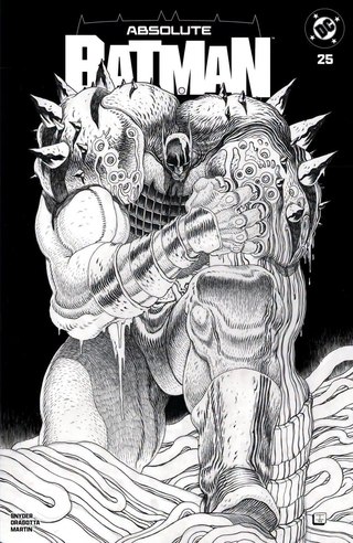
Back to the cover indexBertram’s revealed #25 cover turns a crouching Batman into a dense pattern of contours, rings and folds. The pale body presses against a black field, with huge limbs and jagged shoulders keeping the overall shape legible. At closer range, the marks take on the feeling of wood grain, muscle fibers or something growing.
It has the same appetite for uncomfortable anatomy that makes his #1 cover so strong, but the monochrome presentation gives the linework even more attention. I prefer the first image’s forceful depth, which is why that one sits higher. This is still a compelling piece of announced cover art.
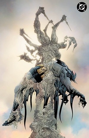
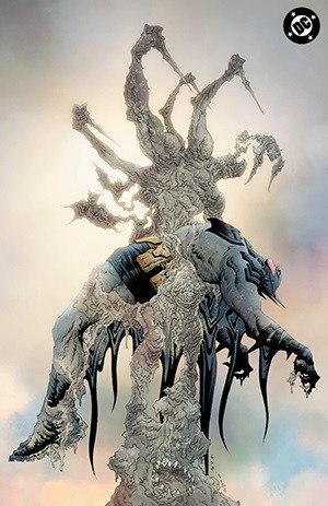
Cover art: Jae Lee.Dynamic Forces cover listing Absolute Batman #23Number 23: A frightening kind of stillness
Jae Lee
Dynamic Forces exclusive, virgin edition
Back to the cover indexBatman hangs across a pale, many-armed organic form, his dark costume cutting through its fine, tangled texture. The creature rises into a softly colored sky, leaving enough space around the silhouette for its strange shape to register. The body in its arms feels heavy and limp.
Lee makes the image unsettling by slowing everything down. There is no crowd of attackers or burst of debris to follow. Your attention stays with the careful arrangement of limbs and the contrast between pale surface and black fabric. That stillness gives the cover a distinct place among the louder images in this ranking.
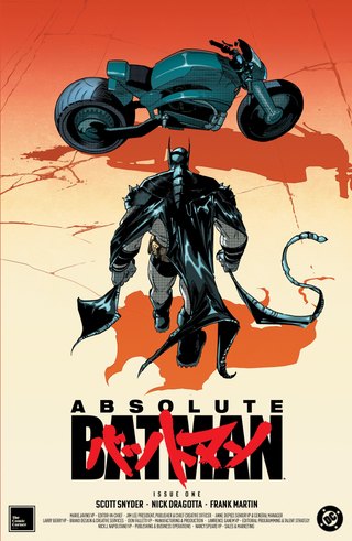
Cover art: Javier Fernández.Original NYCC exclusive listing Absolute Batman #1Number 22: An Akira entrance
Javier Fernández
The Comic Corner / NYCC exclusive, Akira homage, full-color edition
Back to the cover indexThe overhead view of Batman approaching his motorcycle makes the Akira homage immediately recognizable. Fernández makes the borrowed setup fit the Absolute design: broad shoulders, heavy boots and an oversized rear tire give the image a blunt physical weight. The cape curls around that solid silhouette, adding movement before the bike has even started.
Orange pavement and a cream foreground make the cool blue-black figure and machine easy to read. Long shadows pull the eye sideways, while red Japanese lettering locks the reference into the cover design. I like the space around everything. It gives the bike and the body room to register as shapes, and lets the moment before departure carry the image.
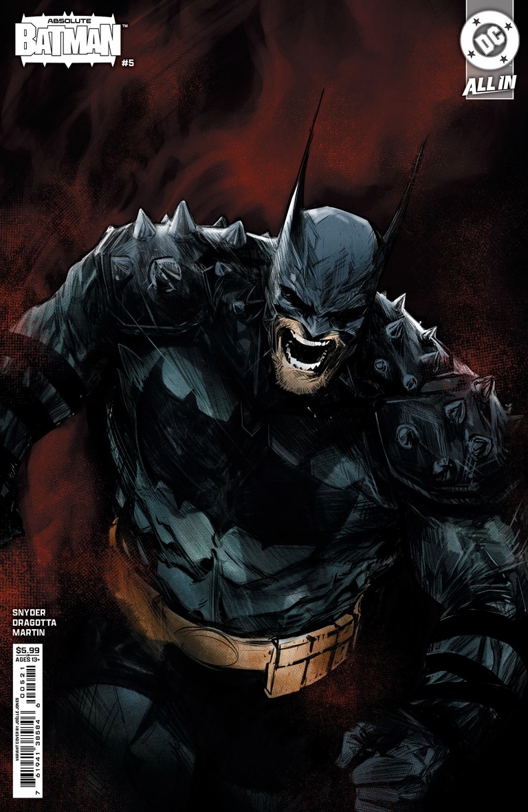
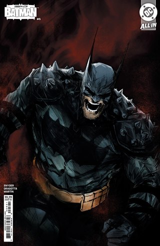
Cover art: Joëlle Jones.Lunar edition listing Image source Absolute Batman #5Number 21: Rage at close range
Joëlle Jones
Cover B, cardstock variant
Back to the cover indexJones brings Batman close enough that his spiked shoulders nearly crowd out the setting. The open mouth and lowered head give the pose an immediate emotional charge. Rough blue highlights describe the dark armor against a smoky red background, while the belt provides a small, warm break across the body.
I like how much expression survives inside that bulky design. The costume could easily swallow the person wearing it, but the face remains the point of the image. It is a direct, forceful portrait, and the tight framing gives the anger very little space to dissipate.
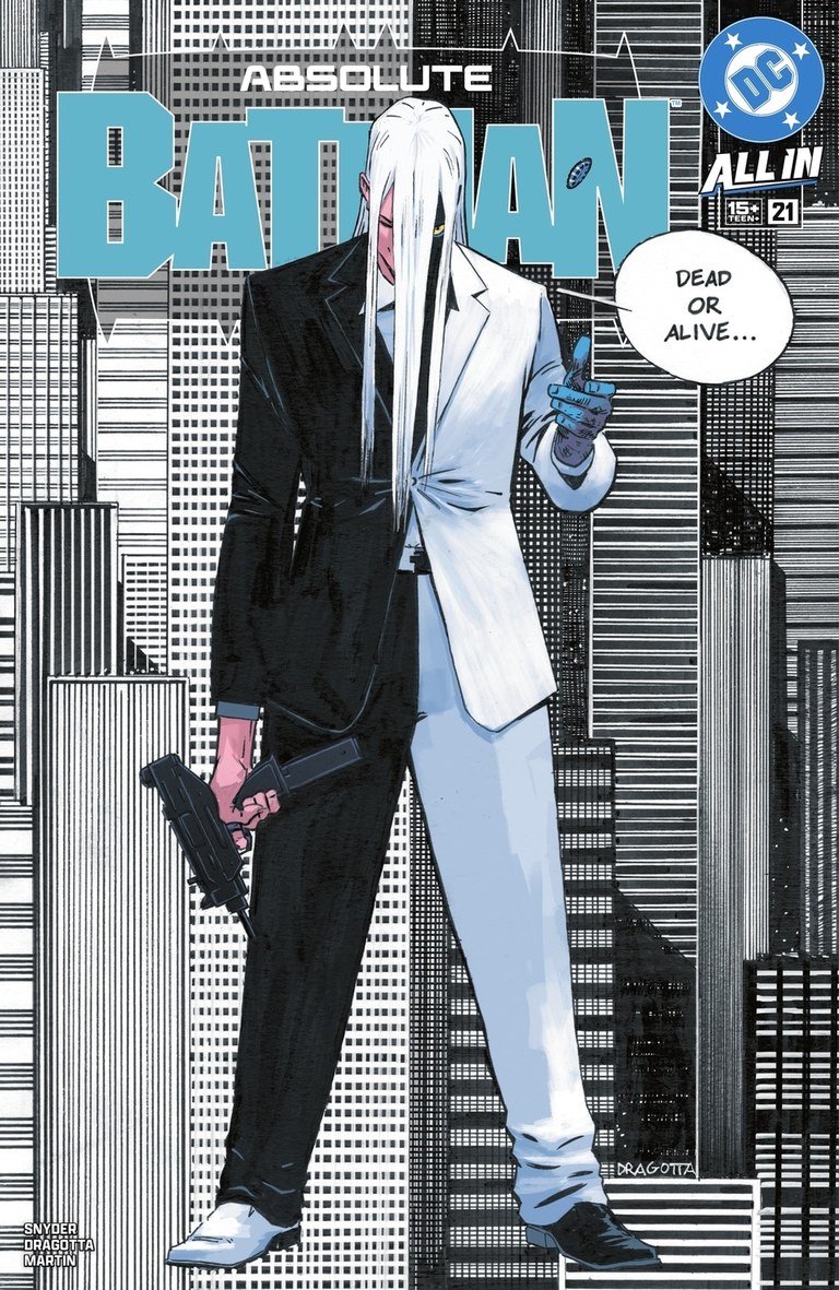
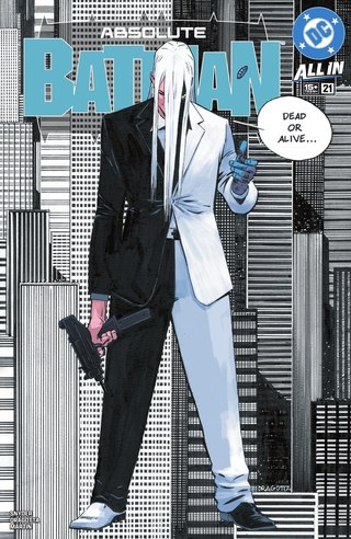
Cover art: Nick Dragotta and Frank Martin.DC cover reference Absolute Batman #21Number 20: A divided figure in a rigid city
Nick Dragotta and Frank Martin
Cover A, main cover
Back to the cover indexThe black-and-white suit divides the central figure straight down the page. A long white fringe, a flipped coin, a gun and mismatched shoes extend the idea into smaller details. Behind him, the city becomes a dense grid of vertical and horizontal lines. The few cyan and pink accents have plenty of room to stand out.
This earns a place because of how thoroughly the character design controls the whole cover. The architecture reinforces the symmetry without making the image lifeless, and the small gestures interrupt it just enough. It is a reminder that this series can produce a striking cover without putting Batman in the center.
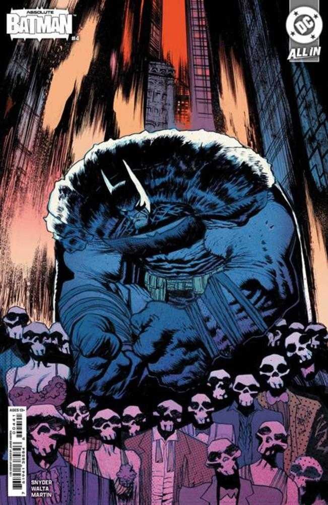
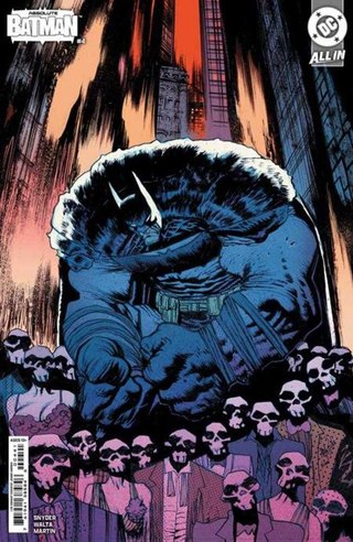
Cover art: James Harren.Lunar edition listing Image source Absolute Batman #4Number 19: The crowd becomes a measuring stick
James Harren
Cover D, 1:25 cardstock variant
Back to the cover indexA row of skull-masked people crowds the bottom of the page. Behind them, a blue-black Batman rises into the narrow space between tall buildings. Their repeated small heads make his shoulders seem absurdly large. The orange sky pushes that cold mass forward, while the steep architecture squeezes the whole scene together.
Harren uses the crowd to make the figure feel overwhelming without losing the composition. Your eye can read the pattern of masks first, then travel upward to the thing dwarfing them. It is a forceful image of size, and the slightly grotesque exaggeration gives it character.
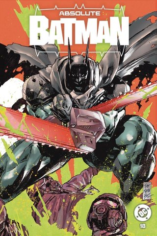
Cover art: Clay Mann and Seth Mann.Creator’s exclusive listing Additional credit Absolute Batman #18Number 18: Chainsaw Batman
Clay Mann and Seth Mann
TheMannBoyz exclusive, Chainsaw Man homage, spot foil/glow-in-the-dark wraparound
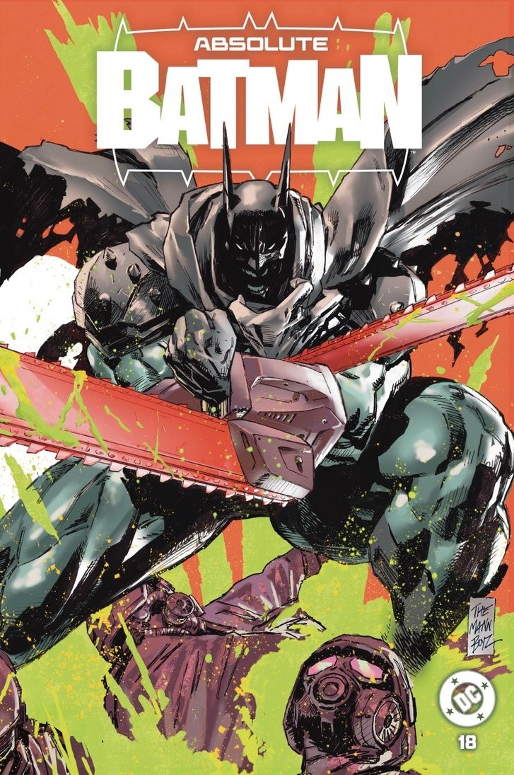
Back to the cover indexThe Chainsaw Man homage hits first through that hot orange background slashed with acid green. Crossed saws cut across Batman’s low, compressed crouch, while his cape tears outward and helmeted figures crowd the bottom of the image. Clay and Seth Mann keep his face buried in black, so the lit armor and bright blades do most of the work.
Open the cover out and Ivy’s enormous face changes the balance. Her human features and swollen, unnatural eye turn the back into a horror portrait, with splashes of orange and green tying both halves together. I like how completely the reference suits this Batman’s physical excess. The machinery, the grotesque anatomy and the violent color all feel at home here.
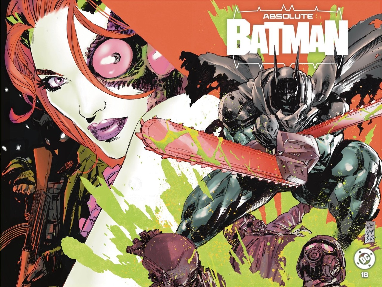
The complete wraparound: Ivy’s portrait on the back and Batman’s crossed chainsaws on the front. Cover art by Clay Mann and Seth Mann.Open full wraparound 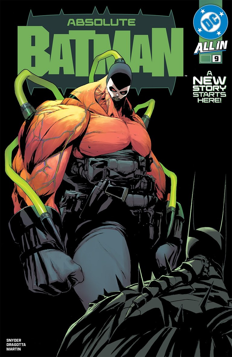
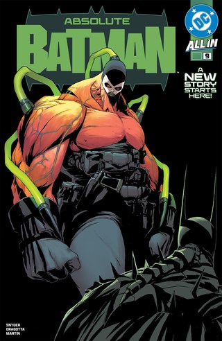
Cover art: Nick Dragotta and Frank Martin.DC cover reference Absolute Batman #9Number 17: Making Absolute Batman look small
Nick Dragotta and Frank Martin
Cover A, main cover
Back to the cover indexBane fills almost the entire cover. His head looks tiny above the mountain of orange muscle, and green tubing loops around the body like a diagram of its machinery. Batman is reduced to a cropped presence in the foreground, giving us an immediate measure of what stands in front of him.
That is a smart use of a design the series has already taught us to read as enormous. Dragotta and Martin make scale itself the threat. The black background keeps the comparison clean, so the cover’s central idea arrives before you need any context from the issue.
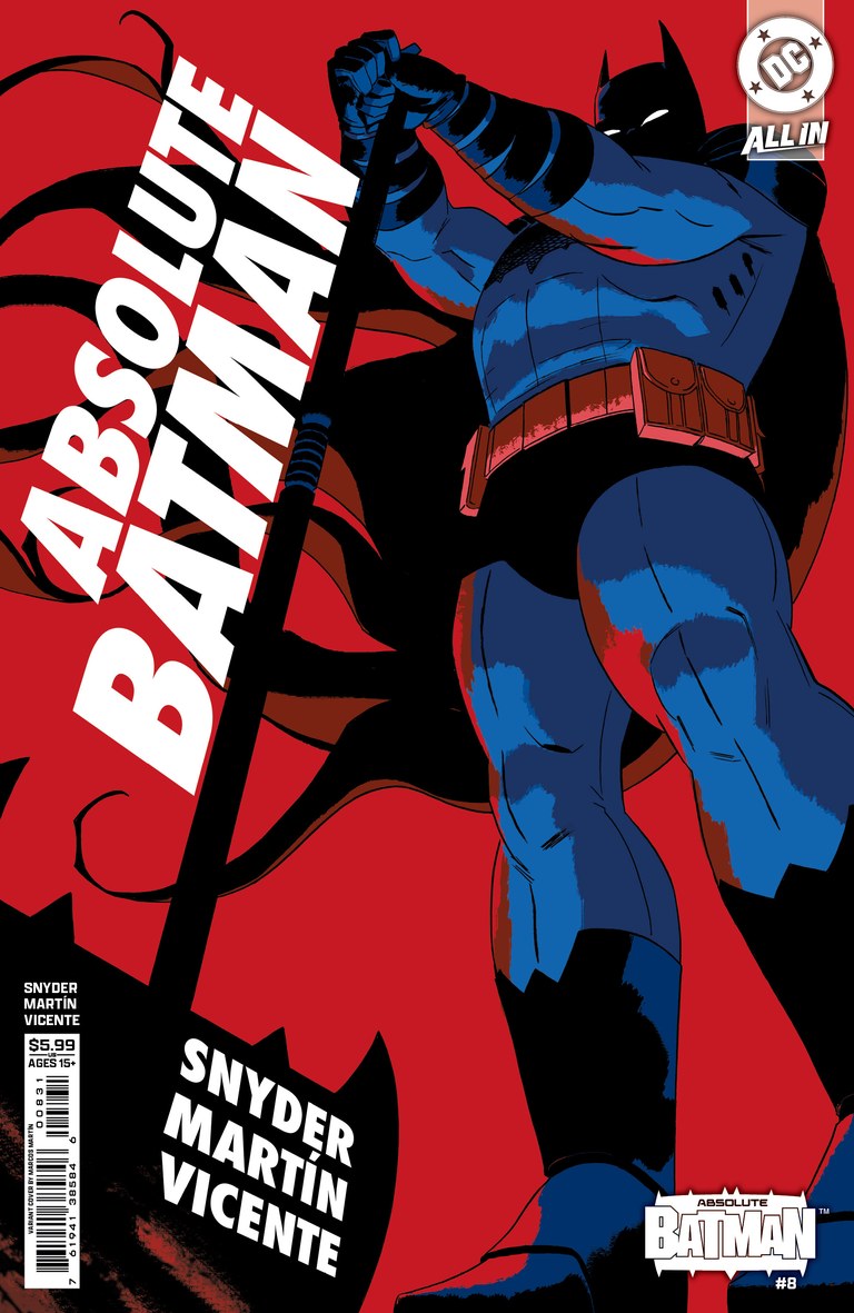
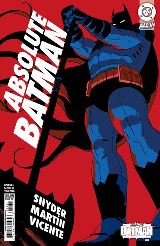
Cover art: Marcos Martín.Lunar edition listing Image source Absolute Batman #8Number 16: An axe swing across the page
Marcos Martín
Cover C, cardstock variant
Back to the cover indexMartín takes a low viewpoint and commits to it. Batman’s legs loom in the foreground, his arms lift above him, and the long axe handle pulls a diagonal through the image. The slanted white title follows that energy. Flat red behind blue and black gives the whole cover the clarity of a poster.
There is very little wasted information. The angle, the lettering and the grip all prepare us for the swing. It earns its place through that confidence in one action and a few large shapes, with enough empty color around them to make the movement readable.
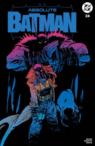
Cover art: Daniel Warren Johnson.Original exclusive listing Absolute Batman #24Number 15: An enormous figure at your shoulder
Daniel Warren Johnson
Felix Comic Art exclusive, cardstock edition
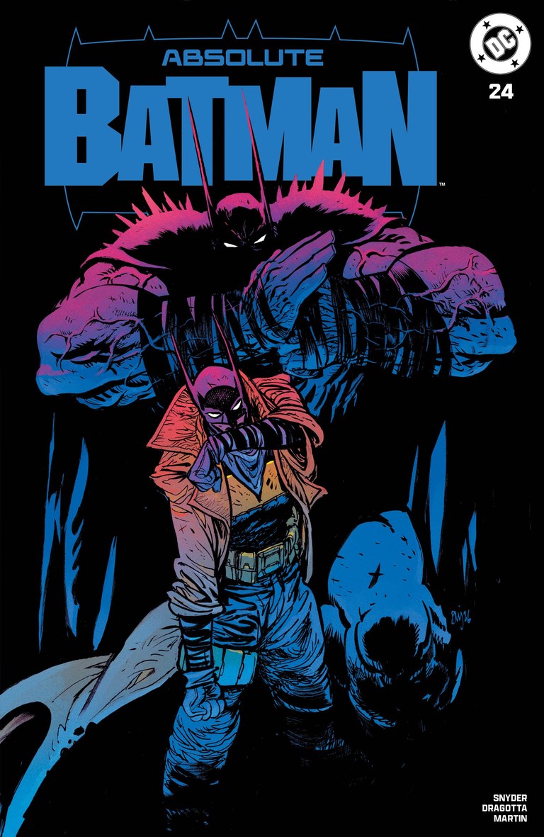
Back to the cover indexThe smaller, trench-coated figure points straight toward the reader while a colossal Batman towers behind him. Magenta runs across the larger figure’s shoulders before shifting into electric blue. Against the black background, the two silhouettes and that abrupt difference in scale carry the composition.
Johnson makes the pairing feel confrontational. The pointed hand brings us into the scene; the body behind it supplies the pressure. There is very little environment to interpret, so the relationship between those two figures stays clear. It is a particularly effective use of the Absolute design’s exaggerated upper body.
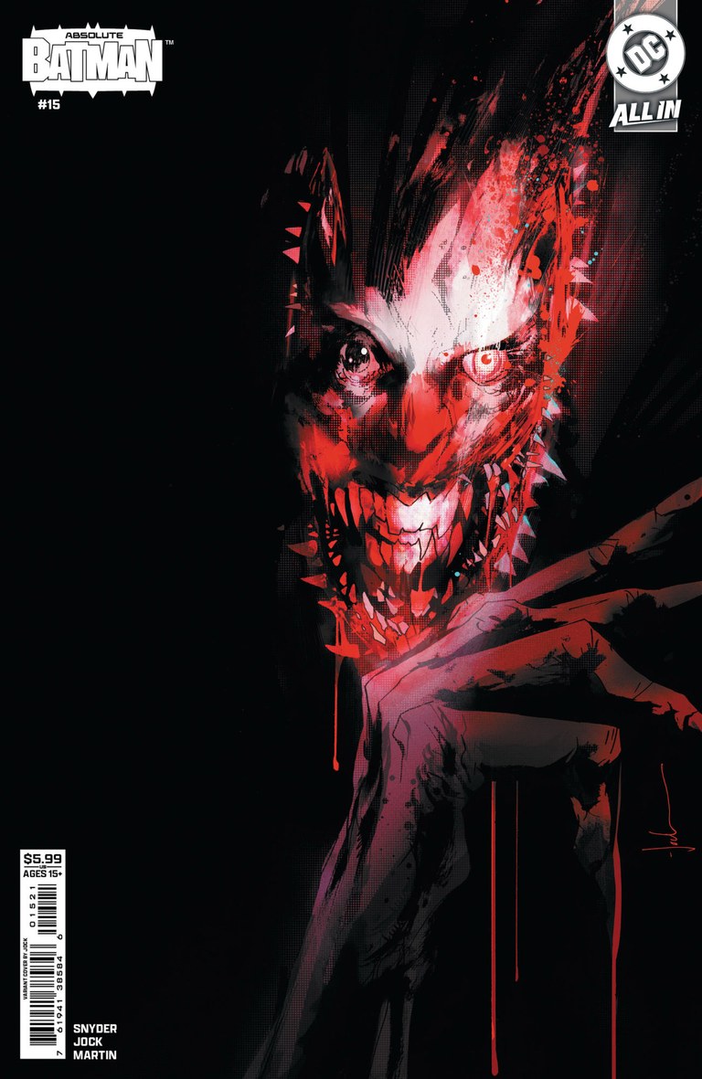
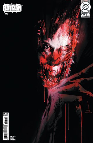
Cover art: Jock.Lunar edition listing Image source Absolute Batman #15Number 14: A grin breaking out of the dark
Jock
Cover B, cardstock variant
Back to the cover indexJock leaves most of the cover black. A red-and-white face tears through that space, followed by thin fingers and streaks that drag the image downward. The eyes and teeth are the first things to catch, but the rough marks around them make the face difficult to settle into a stable shape.
The restraint is what I like. Every exposed piece of the portrait has more force because so much remains submerged. It offers a very different encounter with the Joker from Dragotta’s pale playing-card cover for the same issue, and the two approaches make an excellent comparison.
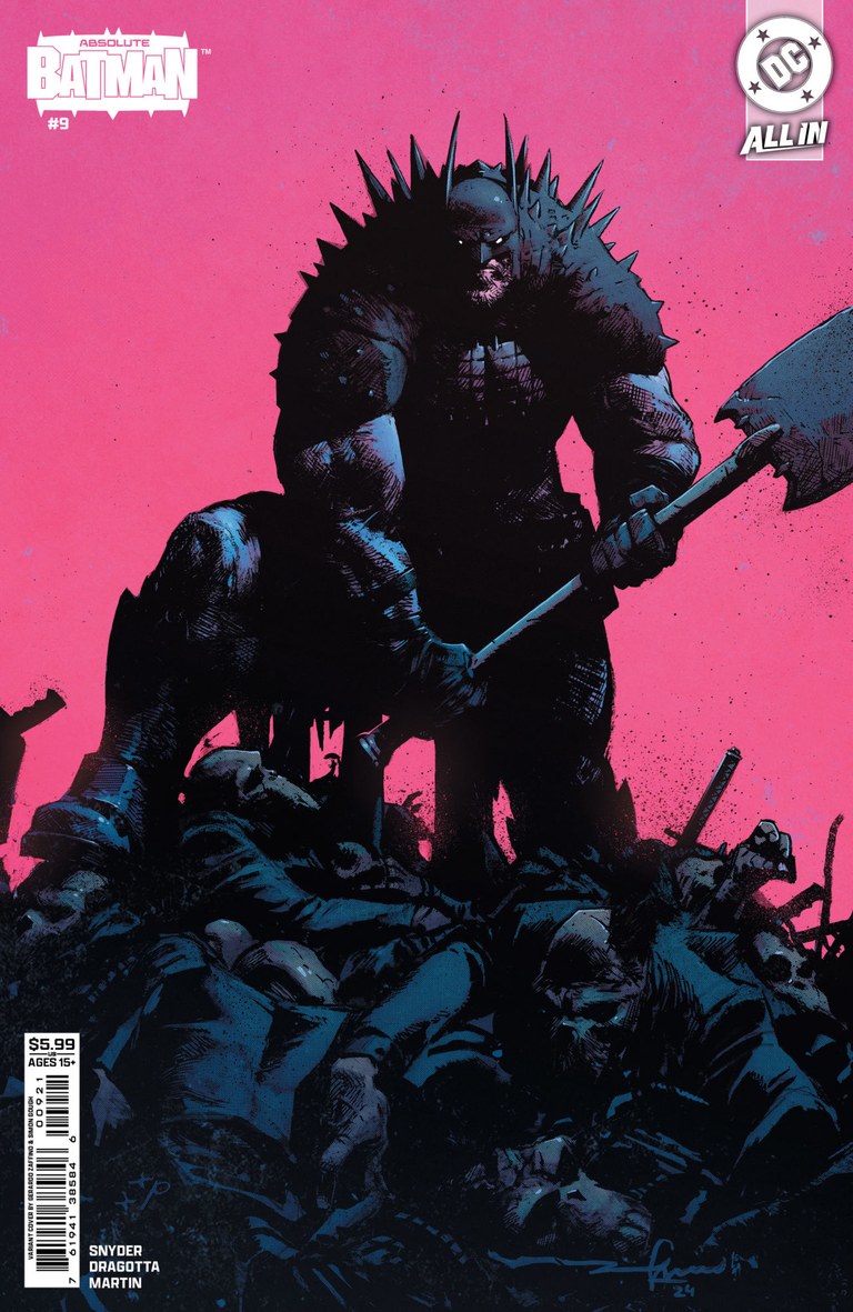
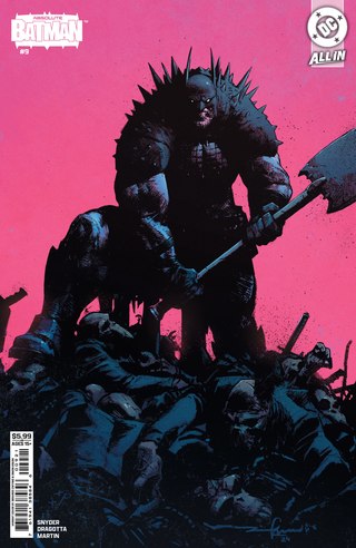
Cover art: Gerardo Zaffino and Simon Gough.Lunar edition listing Image source Absolute Batman #9Number 13: Hot pink, heavy shadow
Gerardo Zaffino and Simon Gough
Cover B, cardstock variant
Back to the cover indexA huge field of pink sits behind a nearly black Batman, whose axe cuts across the cover on a hard diagonal. Below him, armored figures form a rough mound. Blue light catches just enough of his body to distinguish muscle, cape and spikes without breaking the dark silhouette apart.
Zaffino and Gough get an enormous amount from that limited palette. The bright background makes the foreground feel heavier, while the axe gives the eye a clean route through the mass of detail. It is one of the strongest examples here of a color choice making a familiar heroic pose feel newly abrasive.
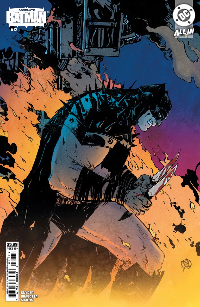
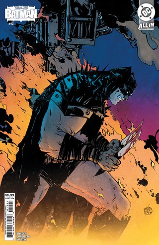
Cover art: Paul Pope and José Villarrubia.Scott Snyder’s cover gallery Absolute Batman #12Number 12: Fire beneath the armor
Paul Pope and José Villarrubia
Cover B, cardstock variant
Back to the cover indexPope’s Batman feels assembled from rough, stubborn marks. The shoulder spikes, bent neck and clenched hands give the body an uncomfortable tension, while big black shapes prevent the drawing from becoming fussy. Villarrubia sets orange fire against a blue and violet sky, lighting the figure from below.
There is a lot of personality in the way the armor catches that light. Its uneven edges and thick shadows make the costume feel handled and battered. The cover holds the character in a single braced moment, and the heat around him makes that stillness feel temporary.
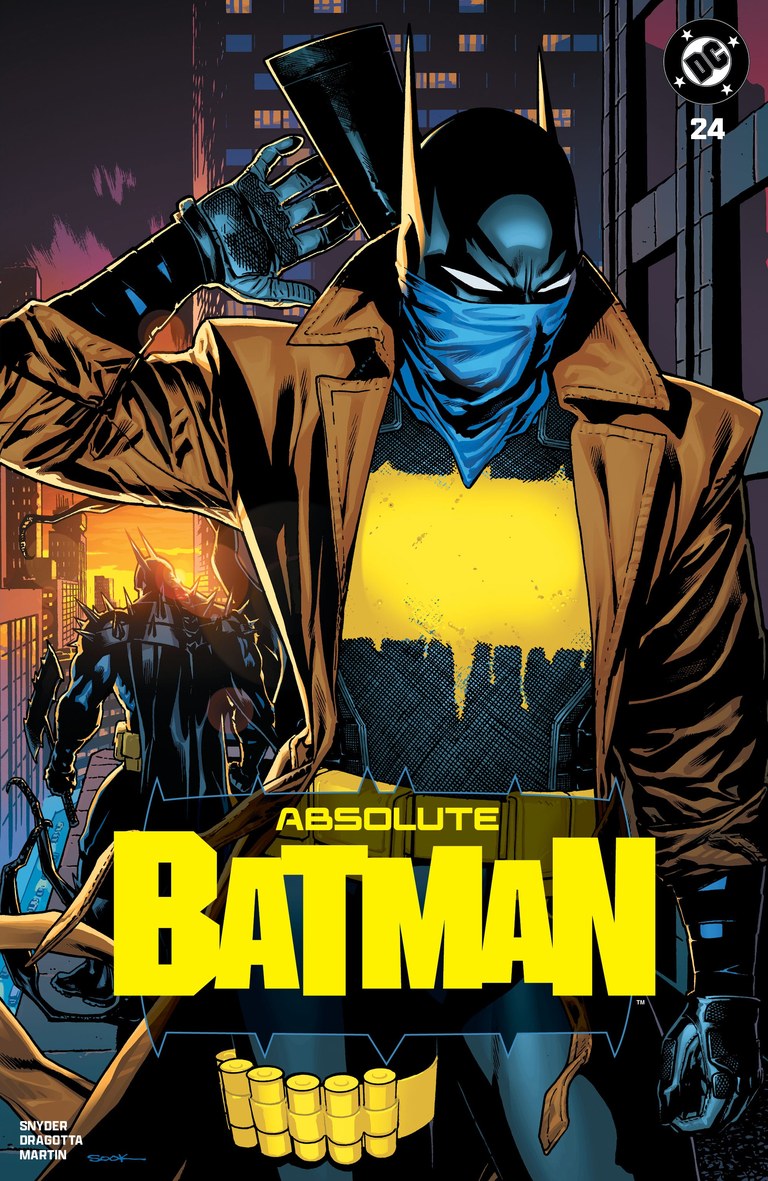
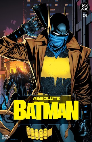
Cover art: Ryan Sook.Original exclusive listing Absolute Batman #24Number 11: A crime film in one frame
Ryan Sook
Felix Comic Art exclusive, cardstock edition
Back to the cover indexSook puts the yellow chest emblem and blue face covering at the center of a dark alley, framed by a brown trench coat. The gun over the foreground figure’s shoulder adds another strong diagonal. Farther back, another Batman approaches through a patch of warm light, giving the image a second point of interest.
That separation between foreground and background is what makes the cover feel like a scene. The closer figure commands attention, but the distant one supplies the question. Sook’s controlled lighting turns the redesigned costume into part of a tense, readable little drama.
- Into the top ten
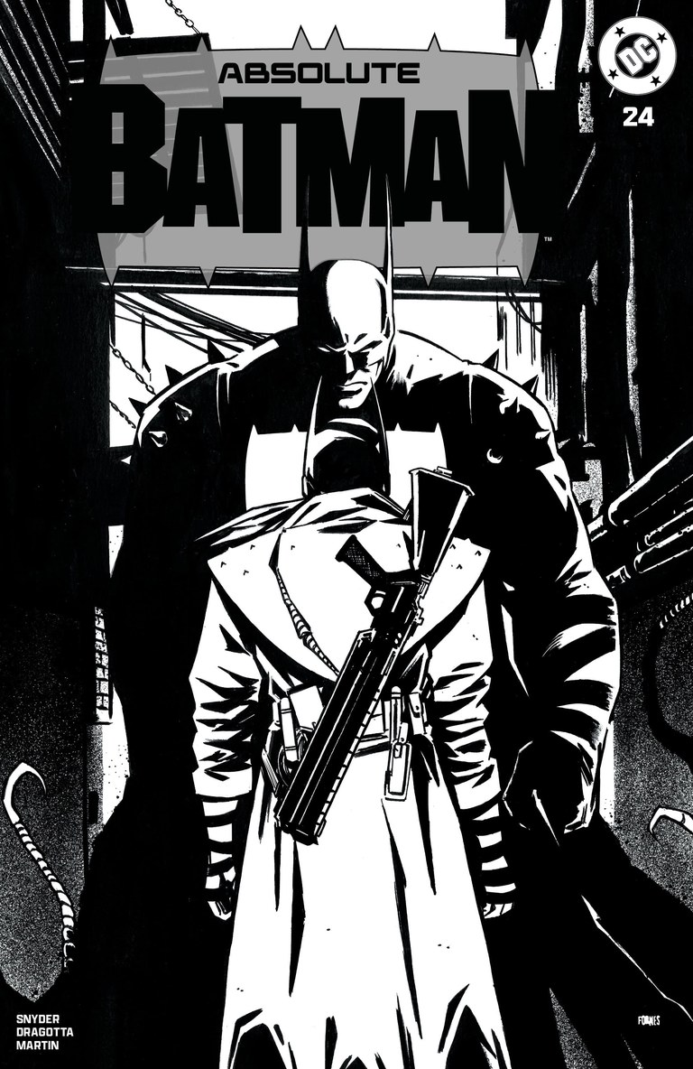
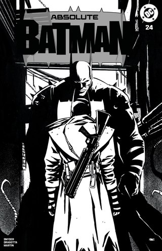
Cover art: Jorge Fornés.Original exclusive listing Absolute Batman #24Number 10: An alley in black and white
Jorge Fornés
Third Eye exclusive, black-and-white edition
Back to the cover indexThe bright trench coat in the foreground faces a much larger Batman in the alley. Fornés builds the confrontation out of stark shapes: white fabric, black shoulders, a long gun, hanging lines and narrow slivers of light. The two figures almost lock together into one dark-and-light pattern.
The black-and-white edition makes that structure especially easy to appreciate. There is depth in the alley, but the page also works as a flat arrangement of opposing masses. The viewer stands close behind the smaller figure, which makes the larger one feel more imposing. It is an economical, confident piece of noir staging.
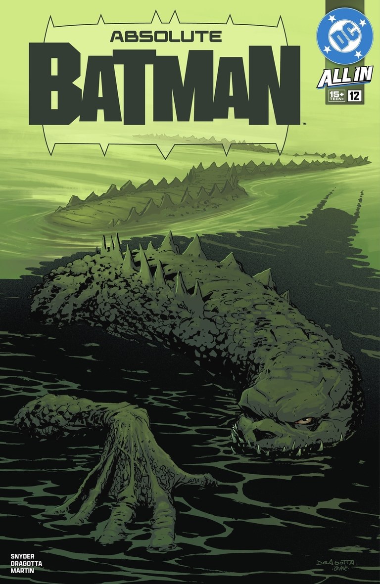
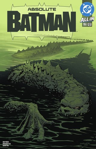
Cover art: Nick Dragotta and Frank Martin.DC cover reference Additional credit Absolute Batman #12Number 9: Look into the water
Nick Dragotta and Frank Martin
Cover A, main cover
Back to the cover indexCroc’s body stretches back through green-black water, growing smaller until it almost disappears. The low angle gives the head and armored hide a heavy, immediate presence. Then Batman’s silhouette appears in the water beside him, changing what first looked like a creature portrait into an encounter.
That second discovery is the reason this cover ranks so highly. Dragotta organizes the space so the eye has somewhere to travel, and Martin’s narrow range of greens keeps the water and body connected. The suspense comes from watching carefully. A good cover can create a small act of reading before the story begins.
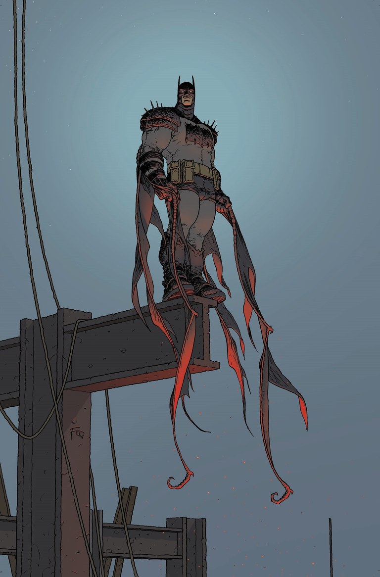
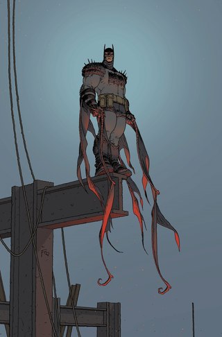
Cover art: Frank Quitely.DC cover reference Absolute Batman #6Number 8: A long way down
Frank Quitely
Cover B, cardstock variant
Back to the cover indexQuitely places Batman at the end of an exposed steel girder and gives him a great deal of empty blue sky. The long strips of cape hang beneath his body, extending the drop. Warm color on their undersides quietly separates them from the cold background. Every line has room to register.
I like the balance between bulk and delicacy. This Batman has weight, yet his position depends on a small patch of steel. The sparse setting makes you notice the feet, the hanging fabric and the distance around him. It is a patient cover, and that patience makes the height convincing.
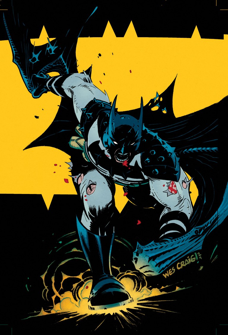
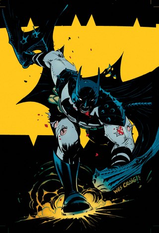
Cover art: Wes Craig and Mike Spicer.DC cover reference Absolute Batman #1Number 7: A black shape breaking through yellow
Wes Craig and Mike Spicer
Cover B, cardstock variant
Back to the cover indexCraig bends Batman into a forward rush, with his boot, clenched expression and trailing costume all pushing toward us. Behind him, a huge yellow bat shape gives the drawing an immediate graphic punch. Spicer’s restricted color makes the silhouette easy to read, while the torn cloth and small red marks keep the surface rough.
The image works at two speeds. At thumbnail size, it is a bold collision of yellow and black. Up close, the strained body and ragged edges make the movement feel difficult and physical. It captures a Batman who has to force his way through the page.
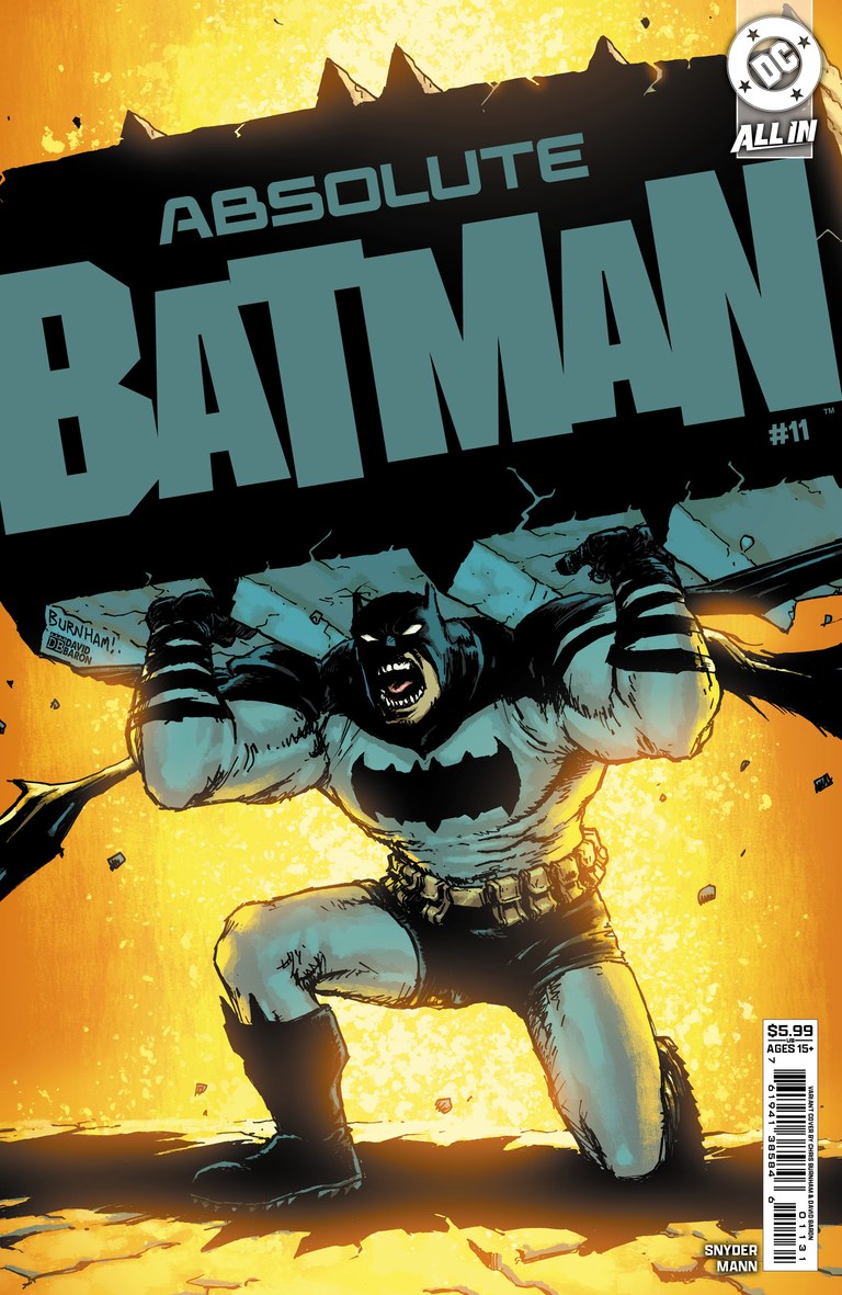
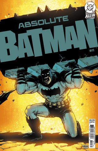
Cover art: Chris Burnham and David Baron.Scott Snyder’s cover gallery Absolute Batman #11Number 6: The title has weight
Chris Burnham and David Baron
Cover C, cardstock variant
Back to the cover indexBatman is physically holding up the enormous Absolute Batman masthead. Burnham turns something we usually read past into the cover’s central object, then makes the body underneath it work: bent knee, braced arms, open mouth, shoulders taking the strain. The idea is funny, but the pose gives it real effort.
Baron’s blazing yellow and orange surround the cooler figure and make the slab of lettering feel even heavier. It is a complete cover concept, with drawing, color and typography pulling in the same direction. That kind of thought about the whole page deserves a high place on this list.
- The final five
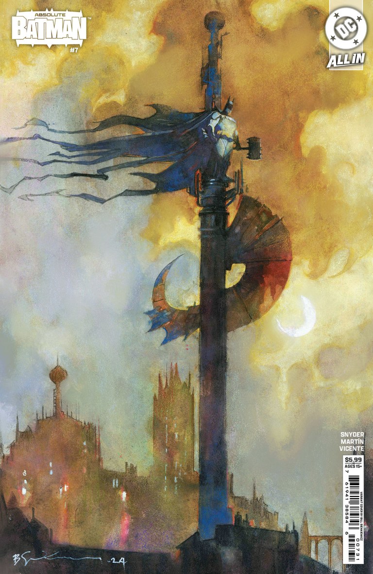
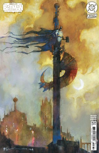
Cover art: Bill Sienkiewicz.Lunar edition listing Image source Absolute Batman #7Number 5: A haunted landmark above Gotham
Bill Sienkiewicz
Cover C, cardstock variant
Back to the cover indexA small Batman stands high on a thin vertical structure, his cape streaming across a sky of gold, gray and pale blue. The city below dissolves into loose marks and mist. That long upright shape draws the eye through the whole cover, making the figure’s height feel precarious before you have worked out every architectural detail.
Sienkiewicz lets atmosphere do an enormous amount of work. Batman becomes part of the skyline, almost a weathered monument you have spotted through the haze. It is one of the covers here that most invites looking from a distance, then moving closer to discover what the paint is doing.
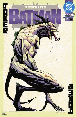
Cover art: Nick Dragotta and Frank Martin.DC cover reference Absolute Batman #15Number 4: A Joker card you would rather not draw
Nick Dragotta and Frank Martin
Cover A, main cover
Back to the cover indexThe playing-card idea is immediately familiar. The body inside it is anything but comfortable: folded limbs, a ridged back, a stretched mouth and a long, dangling tongue. Dragotta leaves the figure against a pale field, where every awkward piece of anatomy is available for inspection. The upright and inverted JOKER lettering completes the frame.
Martin’s restrained palette helps the drawing feel exposed. There is very little scenery to soften the encounter or pull your attention away. As a villain cover, it understands how frightening a clear view can be. The creature does not need to hide in the dark.
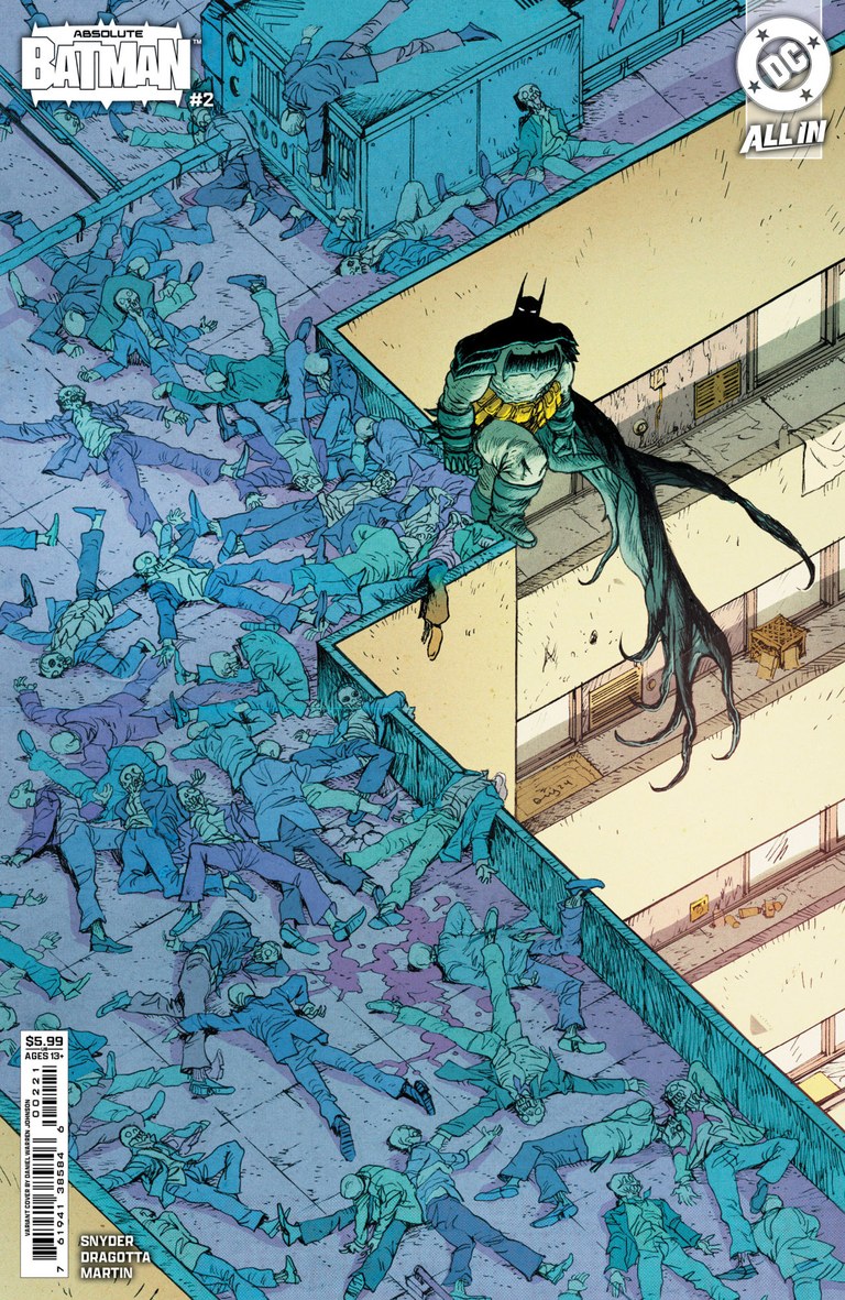
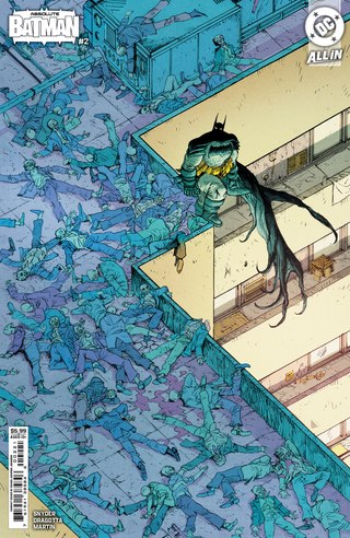
Cover art: Daniel Warren Johnson and Mike Spicer.Lunar edition listing Image source Additional credit Absolute Batman #2Number 3: The fight is already over
Daniel Warren Johnson and Mike Spicer
Cover B, cardstock variant
Back to the cover indexBatman sits at the edge of a rooftop packed with fallen opponents. That pause tells the story. Johnson gives us the aftermath, then lets the sheer number of bodies suggest the fight that came before it. The high viewpoint turns the scene into something you can explore, following figures around the hard angles of the building’s open lightwell.
Cool blue and purple crowd the rooftop; the pale, warm walls of the lightwell give Batman a little breathing room. There is humor in how calmly he occupies it. The cover makes his strength legible through what surrounds him, and it rewards the reader who stops to look at the smaller details.
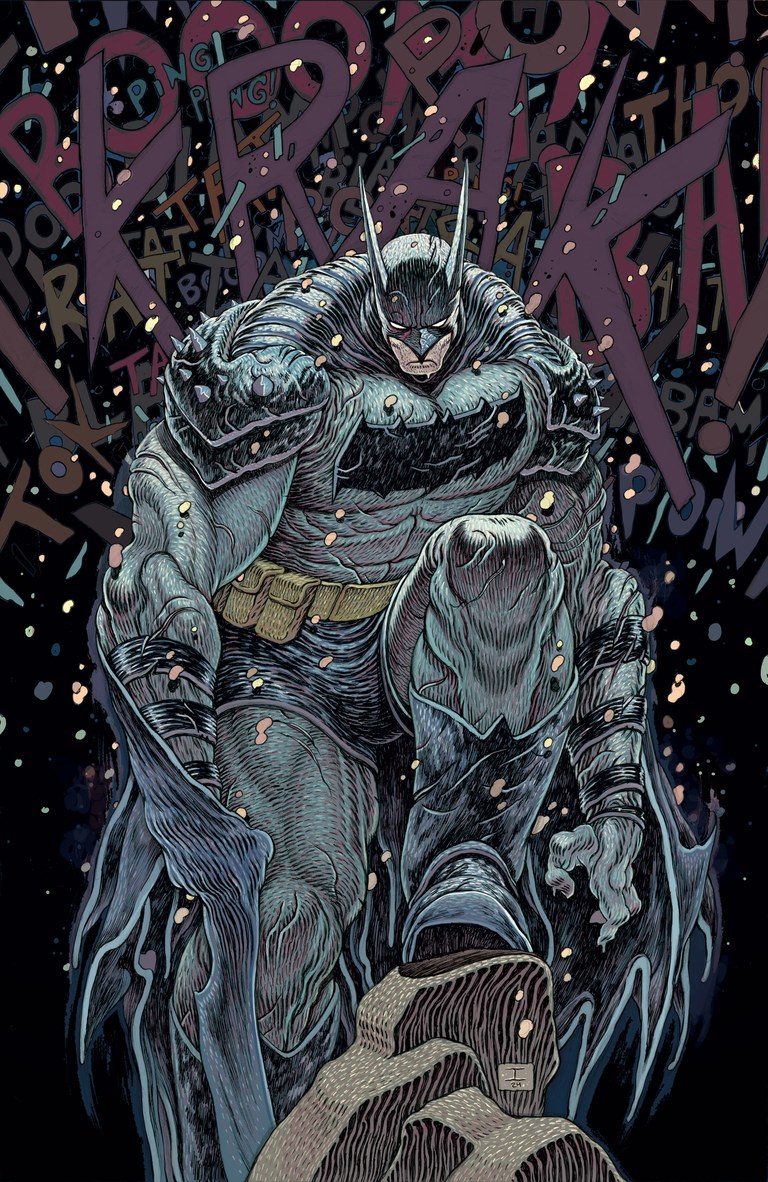
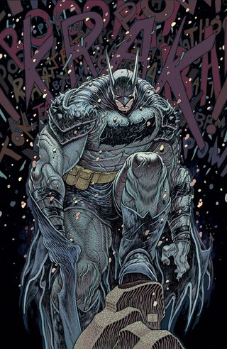
Cover art: Ian Bertram.DC cover reference Absolute Batman #1Number 2: Batman as a living structure
Ian Bertram
Cover F, 1:25 cardstock variant
Back to the cover indexBertram makes the new proportions feel almost biological. Dense ridges and looping lines run across Batman’s shoulders, arms and suit, while one enormous boot pushes into the foreground. His small, lowered face is trapped inside a body that seems to keep growing around it. The drawing is busy, but the looming shape holds everything together.
What earns it this position is the unease. The longer I look, the less the costume feels like a smooth outer layer. It has folds, pressure and a strange internal life. Bertram takes the invitation to make Batman massive and follows it somewhere personal and unsettling.
- Our number one
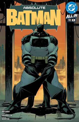
Cover art: Nick Dragotta and Frank Martin.DC cover reference Absolute Batman #1Number 1: The shape of a new Batman
Nick Dragotta and Frank Martin
Cover A, main cover
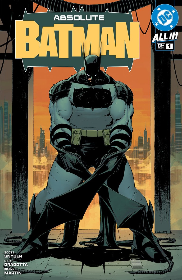
Back to the cover indexThis is the cover everything else on this list gets to push against. Dragotta plants Batman between steel beams, with a body so broad it seems to belong to the construction around him. The squared chest emblem, heavy arms and trailing cape strips make the redesign readable immediately. Martin’s orange skyline and yellow title give all that dark mass a surprisingly warm setting.
I keep coming back to how little the image needs to explain. The stance is steady. The city is close. Batman occupies the space like something built to bear weight. Other covers are stranger, more intricate or more explosive, but this one makes the strongest single statement about the book’s visual identity. It earns the top spot.
The pleasure of this list is the distance between the covers. Quitely can make a patch of empty sky feel dangerous. Burnham and Baron can turn the title into a physical burden. Bertram can make a familiar costume feel alive. The same character gives each of them room to do something unmistakably their own.
My number one is the original Dragotta and Martin cover because it gives all those interpretations such a strong shape to work from. Your favorite may be the image that makes you laugh, the one that unsettles you, or the one you keep noticing across the room. That is a good place to begin the argument.